The beech at the edge of the clearing has ten minutes of decent light left. You have a sketchbook open on your knee, a pencil in one pocket and a pen in the other. Which one comes out? Most of us answer that question out of habit — we are pencil people or pen people — rather than by looking hard at what is actually in front of us. But graphite and ink pull in opposite directions. One is forgiving, soft, and endlessly revisable. The other is decisive, sharp, and permanent from the first touch. Choosing between them for a forest subject is less about skill than about what kind of information you want to record.
Graphite sits on the tooth of the paper. Drag the side of a 2B across cold-pressed stock and the line breaks into flecks, skipping over the valleys in the surface. That flicker is a gift when you are drawing lichen on a granite boulder or the dusting of pale moss on the north side of an oak, because the paper does half the describing for you. Rubbed with a fingertip or a tortillon, graphite becomes a soft mass — the right tool for a hedge of hazel seen at dusk, where individual leaves are irrelevant and only the weight of the foliage matters.
Ink does not whisper. A 0.3 fineliner lays down an even, solid line whether the paper is smooth or rough, and it will not fade into atmosphere no matter how gently you press. That is useful when the texture is the subject: the cracked plates of pine bark, the jagged rim of a broken branch, the exact silhouette of a fern frond. But ink has no soft middle. Where pencil gives you a continuum from pale grey to near-black, ink gives you the paper and the mark, and everything in between has to be built by hand — with hatching, stippling, or a diluted wash.
Pencil is faster at the start and slower at the finish. You can block in a trunk, change its lean, redraw a bough that sits too low, soften a shadow that got too heavy — all without penalty. That freedom suits slow subjects: a fallen log you can study for half an hour, a bank of moss and leaf litter that never moves.
Ink inverts the equation. Each mark lands and stays, so you spend a second longer deciding before the pen touches paper. But once you accept that, ink sketches are often quicker overall, because there is nothing to fuss over. A three-minute gesture of a birch shivering in a gust is almost always better in ink than in pencil. With a pencil, the temptation to keep adjusting turns a lively scribble into a muddled one. A pen closes the door on that.
If the subject might change before you finish — wind in the canopy, a squirrel on a stump, light moving across a clearing — reach for ink and draw in fast, confident strokes. If the subject is still and complicated, and you expect to think your way through it, use pencil.
Graphite feels like it has a huge value range, and it does, but the dark end is disappointing. A 6B pressed hard goes dark and slightly shiny, and it smears if you look at it wrong. In a sketchbook that gets carried through undergrowth, that is a real cost. Ink, by contrast, gives you a clean, matte, genuinely dark dark, and it stays where you put it.
What ink lacks is the midtone. To get a soft grey in ink you must hatch — parallel lines for a first pass, cross-hatching for a second, tiny dots for a third. On a small area this reads beautifully. Across a whole canopy it becomes a chore and can look mechanical. This is why so many ink forest sketches keep the middle values open and let white paper do the work of sunlight. Pencil is the better medium when the scene is mostly midtone: mist between trunks, a shaded path, the gradient of a mossy wall from damp dark at the base to dry pale at the top.
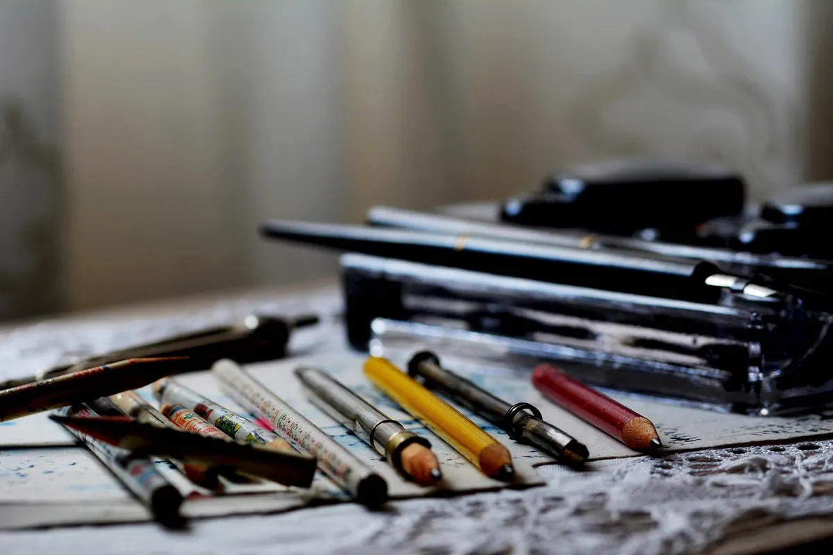
Both media travel well, but they fail in different ways. Graphite breaks, smudges, and coats everything in the pencil case with grey. Ink leaks, dries out, and — if it is not waterproof — runs the moment a drop of rain or a wet hand touches the page. A compact kit that covers both:
Keep the two kits separate. A pencil rubbing against a pen in the same pocket is how nibs get bent and caps get lost.
After enough walks, the decision starts making itself. A rough guide, based on what each medium does well:
You do not have to choose. A light graphite lay-in gives you the proportions and the angle of the trunk, and then you can commit to ink over the top with confidence. Keep the pencil work genuinely light — a heavy graphite line repels ink, and the nib will skip along the top of it, leaving a broken, hesitant result. This combination is especially good for a subject that is half tone and half edge: a stump with soft moss on the crown and a hard, splintered break at the base.
The fastest way to learn your own preference is to stop deciding in advance. On your next walk, pick a single modest subject — a stump, a boulder furred with moss, one good fern — and draw it twice, ten minutes each. First in pencil, then, on the facing page, in ink. Same viewpoint, same light, same amount of time.
You will learn something specific and useful: which one captured the form, which one caught the character, and where you got stuck. Most sketchers find the ink version looks more confident and the pencil version more accurate. Both are worth having. Carry both tools, and let the forest — not your habit — decide which one comes out of the pocket.
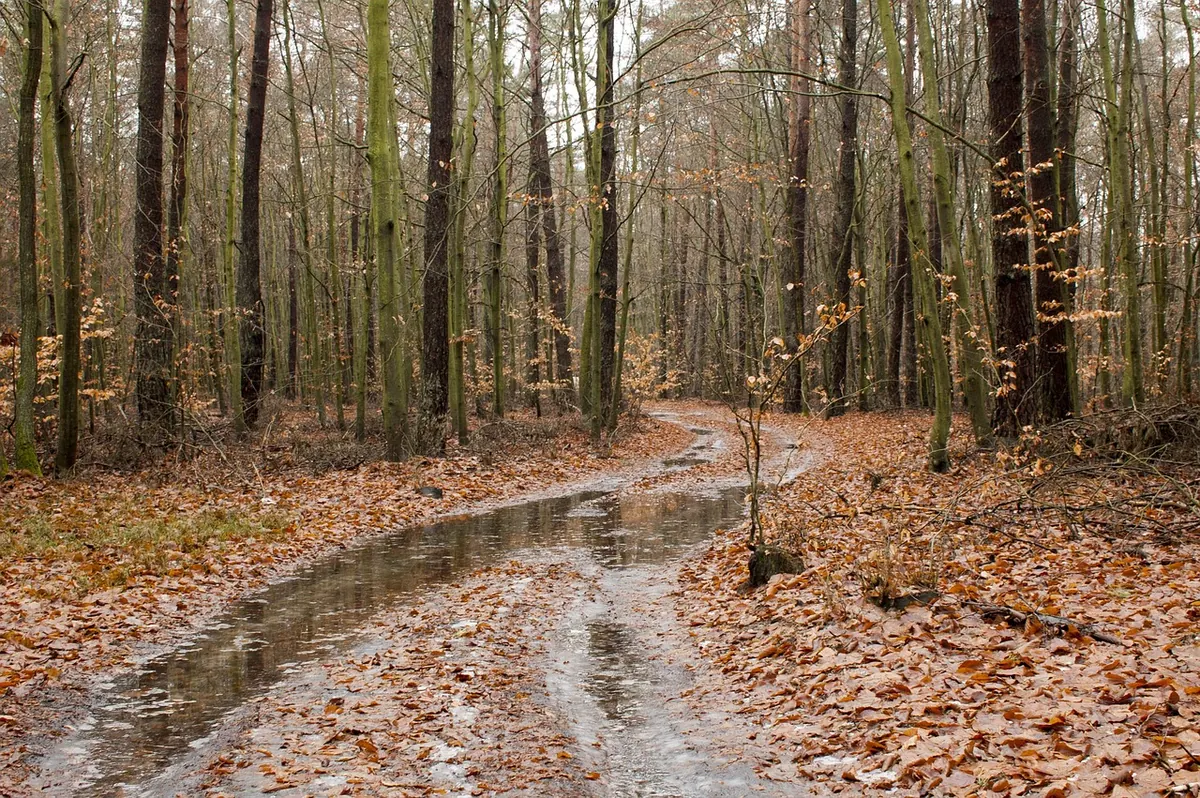
Photo: phydc / Pixabay
A practical guide to sketching Mediterranean woodland edges in late summer, from reading the layered structure of...
A practical guide to reading a leaf’s shape, margin, veins and attachment before you draw, with a clear step-by-step...
Twenty specific sketching prompts for the woods the day after rain — wet bark, beaded droplets, puddle mirrors,...

Sketches and inspiration from the forest.